When you look up at your big empty shelves, it can feel like you’re a painter staring at an empty canvas or a writer contemplating a blank page. The thought of styling shelves is overwhelming, to be less verbose. And it is often difficult to know how to start. How do I arrange everything to look good? How should I group items together? Should I arrange by size or by color?
Check these insider tips to vanquish your shelf decorating nightmares and give your home a strong, pulled together look.
Written by www.kathykuohome.com
Shelf Styling Tip #1. Begin with a Tabula Rasa
Although to many this may seem like an easy, self-explanatory step, it is often the most forgotten or ignored rule of shelf decorating. Edit. Get rid of any clutter that should be thrown out, eliminate anything that you don’t use anymore, and donate anything that may still be good but you just no longer love. A frequent shelf mistake we see is styling with too many (frequently small) objects.
Think of it this way: the more items you have on a shelf, the less of an impact each individual item is going to make. Some pieces are even large and dramatic enough to stand alone on a shelf. Having a few small decorative objects you love is okay when styling shelves, but make sure you retain a healthy mix of decor and keep nothing beyond what you need, especially when it comes to living room shelves.
Shelf Styling Tip #2. Party in the Back
Now that you have everything cleared off and edited down, consider the bookshelf itself before you begin. Don’t like what you’re working with? Explore our collection of standout bookshelves and display cases for a shelving update.
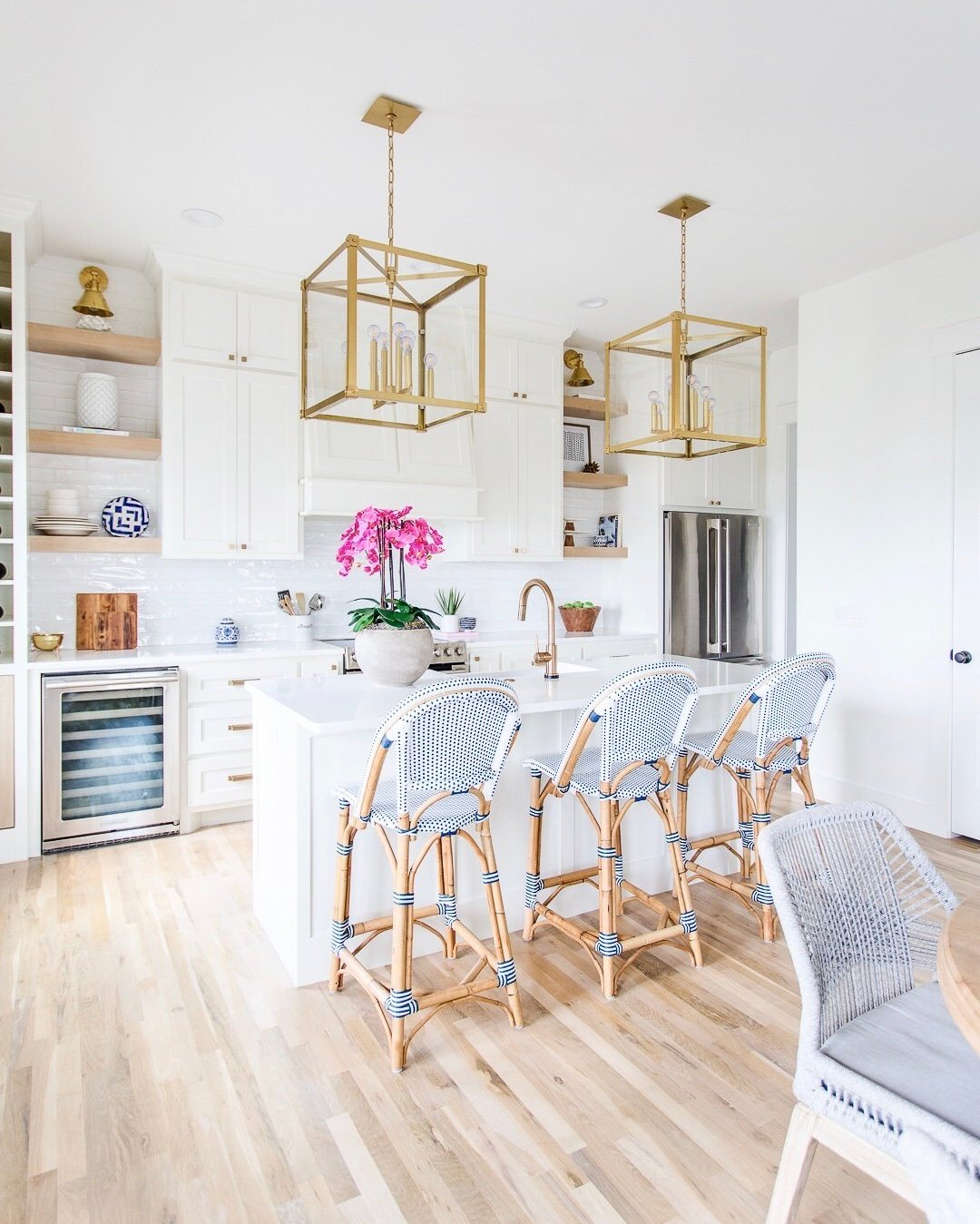
Or, if you have a built-in bookcase, try dressing up the back of the unit with paint, fabric, or wallpaper for a stunning transformation. Drawing attention to the back of a shelf creates a sense of depth that can otherwise get lost, and it can provide a complementary or contrasting element to the shelf decor itself. Just look at the photo above and below for some inspiration!

Shelf Styling Tip #3. Hit the Books
Whether you’re a big reader with a library full of fun novels, or you just have a few favorites that you use for styling, shelf decorating should start with books. How to start? Group your books into small stacks and position them both vertically and horizontally with color peppered evenly throughout for a curated yet pulled-together look. Grouping by color is an alternate method, but this styling technique should only be used if you have a lot of books on your shelf and each color will have enough books for a sizable stack.
Grouping by color is also best for styling a shelf that contains mostly books instead of a vignette of different objects. The number of books in each stack will vary depending on the size of your books and the height and width of your shelves, but stacks should generally include three or more books at minimum. More than twelve or fifteen books might be too many. We also like to play with how stacks on a shelf are arranged: some shelves can have all vertical stacks, some all horizontal, and some can mix it up!

Shelf Styling Tip #4. Know the Importance of Balance when Styling Shelves
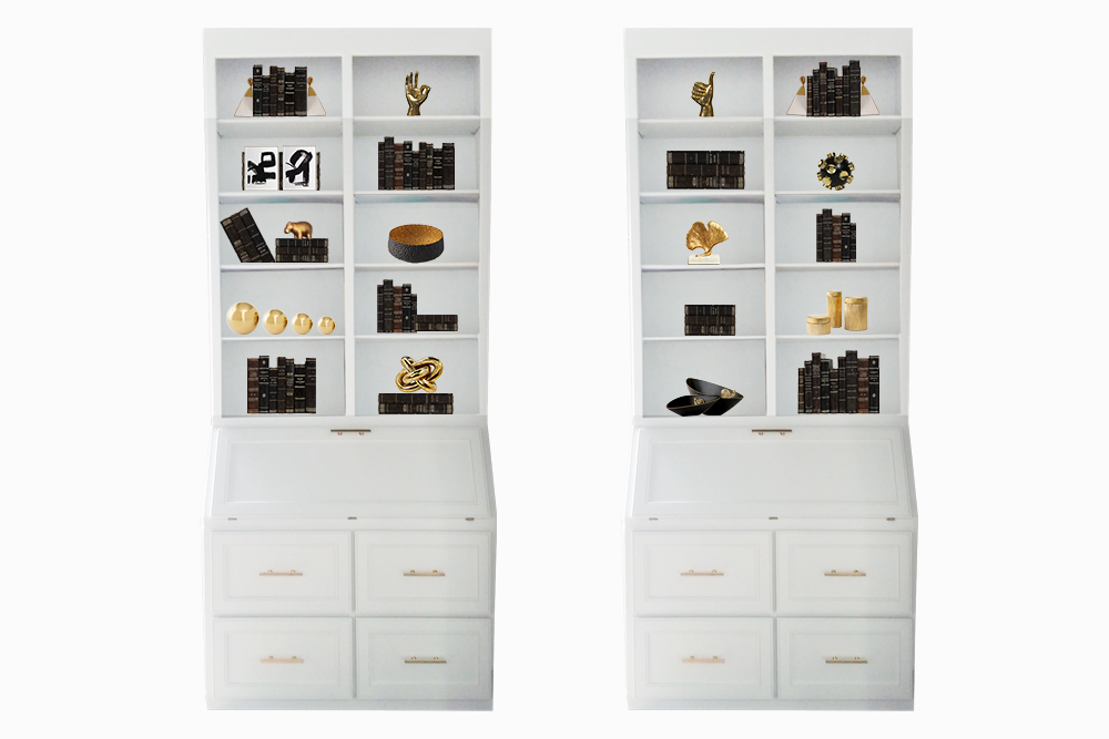
 Notice the symmetry between the top left and right shelves and the bottom left and right shelves, creating four strong corners that frame everything else. You can also see how each column and row has an even spread of heavy decor (the black books) and lighter decor (the black and gold objects.)
#4. Choose a Color Palette
Like with most things related to interior design, it is important to have a clear and consistent color palette when styling shelves. Take a look at the photo above. The white books and creamy built-in shelves make for a rich and airy feel. Mix in the nickel and steel metallic decor, and the room looks complete and effortlessly sophisticated.
As you read this post and scroll through the images, you’ll find that whether bright, neutral, or moody, the palette for a successfully styled shelf typically consists of a base color and then a metallic accent color. This is generally good practice, but don’t be afraid to experiment and bend the rules and throw a third complementary color in there.
#5. Add Artwork
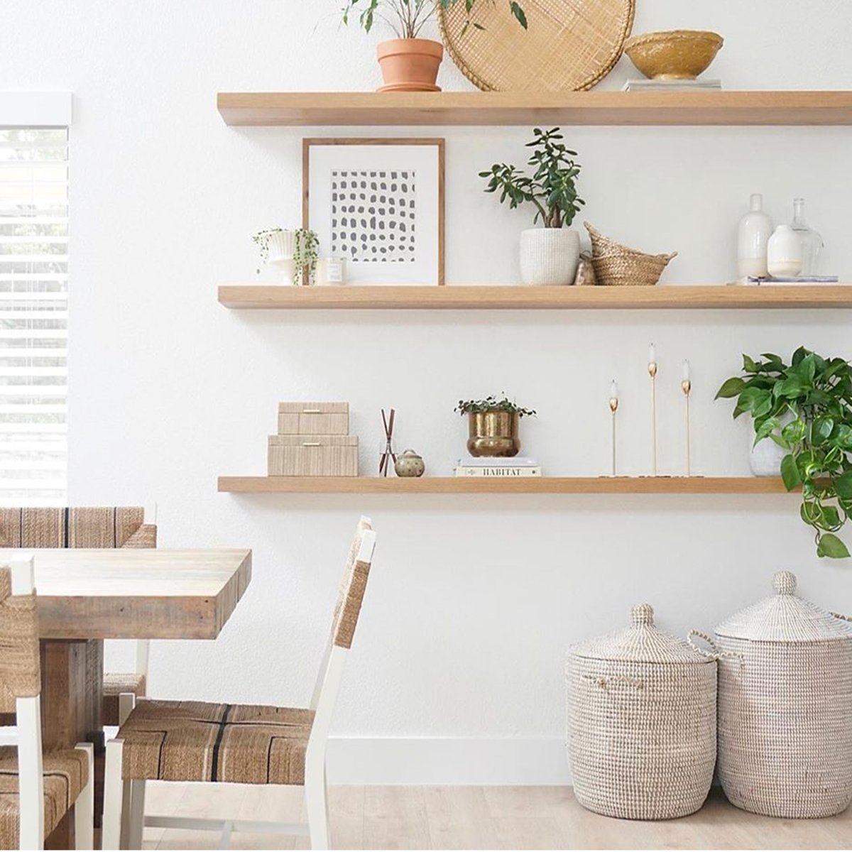
Artwork is typically an overlooked accessory that works wonders on a shelf. It adds personality, and it allows you to express your design creativity. Just prop a piece up, or even hang larger pieces over the cross-section of the moulding for a more “library” look. Artwork also draws the eye to the back of the shelf and allows for a more visually layered look that has depth.
Keep in mind when styling shelves, that artwork takes up a lot of shelf real estate, so it is a better solve for larger shelves (instead of crowding large shelves with too many small objects.)
This is the part that makes shelf styling so much fun! The key is to provide a healthy mix and to think sculptural, especially when working with built in bookshelves.
Shelf Styling Tip #7. Style, Style, Style
Okay, so now you have all of your shelf styling essentials … But this is only half the battle! The last step is to blend together all of the aforementioned tips effortlessly for a fresh and cohesive look. Mix together texture, size, and tone, but be sure to keep to a singular color palette or style.


